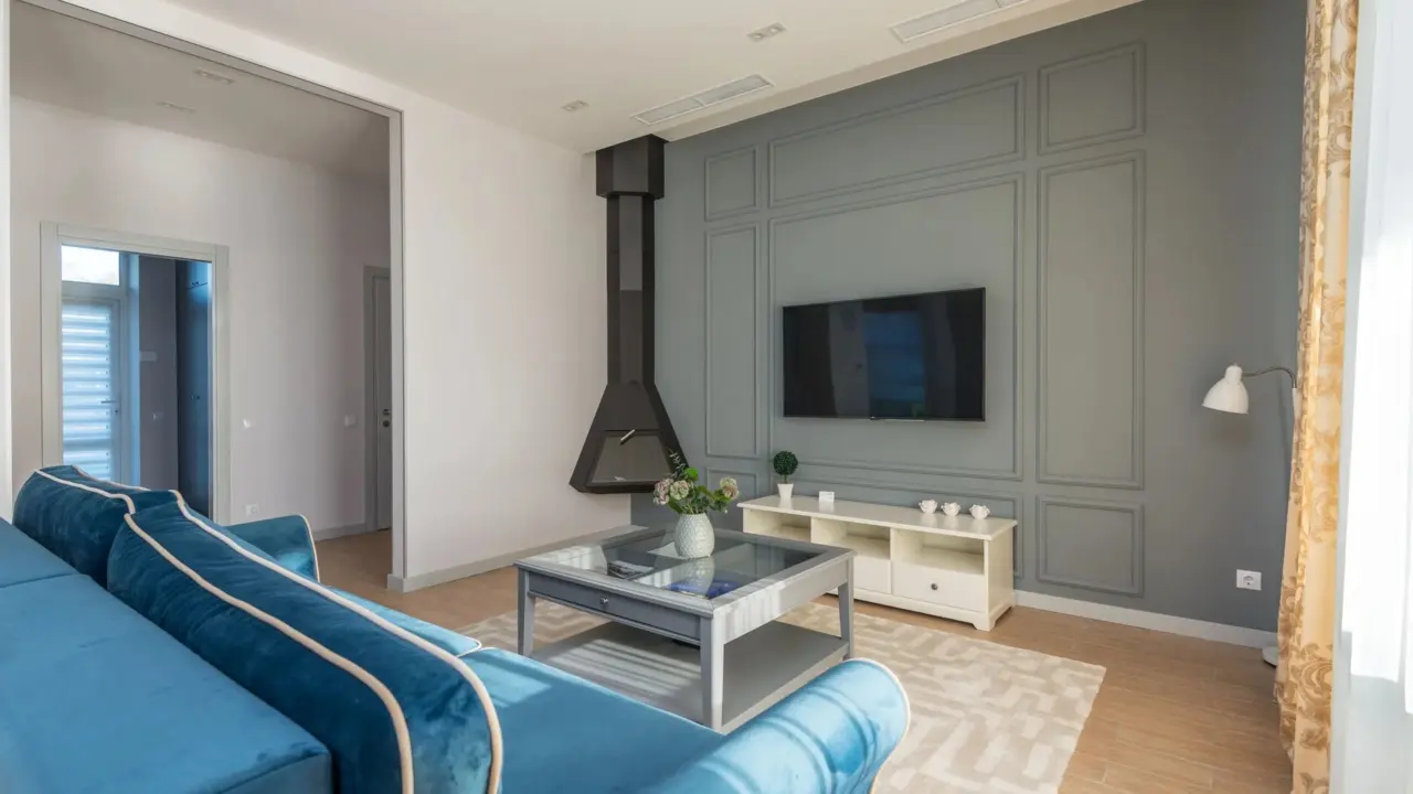
The simplest way to use bigboxratio.com is to read its interior design articles and try the color method it describes, which splits a room about 60 percent main color, 30 percent second color and 10 percent accent. This how-to shows where to find that material, how to apply it to a room and which posts to skip.
| Step | Action |
|---|---|
| 1 | Open the Design or Interior Design category |
| 2 | Read the color method guide |
| 3 | Pick one dominant color for a room |
| 4 | Add a second color and a small accent |
| 5 | Skip posts unrelated to design |
Step 1: find the bigboxratio design pages
Start from the home page, or type bigboxratio.com/ into the address bar if you are working from notes. The menu lists Home, Design, Interior Design, Exterior Design, Lifestyle, About and Contact. Design and Interior Design hold the articles about rooms, colors and furniture; Exterior Design covers outdoor spaces.
Some readers search with a hash symbol, as in #bigboxratio.com, a habit carried over from social media. The symbol does nothing, and the search returns the same site. The About page says the site is passionate about home design and creativity and aims to inspire homeowners, designers and enthusiasts to turn living spaces into personalised havens. It names no founder or staff.
Step 2: learn the color method the bigboxratio guide describes
One article, titled as a guide to bold colors and minimalist decor, explains a method named after the site. It sets one dominant color block, adds one or two supporting colors in smaller areas, keeps furniture simple and limits the palette to three hues or fewer. The guide gives rough proportions of 60 percent for the main color, 30 percent for a secondary color and 10 percent for an accent.
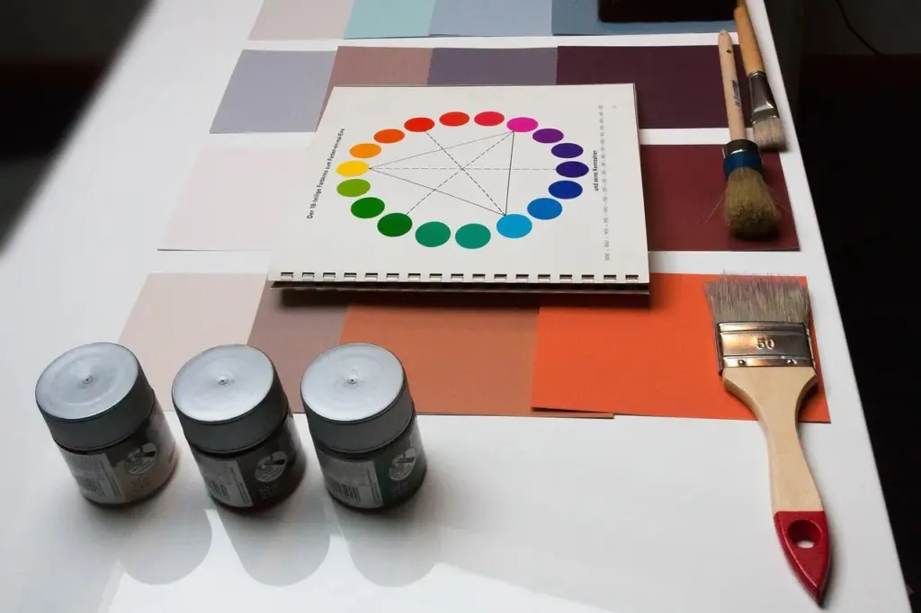
Those numbers will look familiar to anyone who has read about interior design: they are the classic 60-30-10 rule, used by decorators for years. The site’s contribution is the name and the emphasis on large color fields and negative space. That is fine for a beginner, but do not expect a proprietary formula.
Step 3: apply the method to one room
- Choose the room and note its fixed features: flooring, window position and any large furniture you are keeping.
- Pick the dominant color, about sixty percent of the visual field. Walls, a large rug or a sofa can carry it.
- Choose a secondary color for about thirty percent, such as curtains, a second wall or a bookcase.
- Add a small accent for the final ten percent: cushions, art or a lamp.
- Test paint samples on the wall and look at them in the morning and evening before you buy a full tin.
- Remove anything that does not serve the scheme, since the method relies on clear shapes rather than ornament.
The article adds that lighting should reach the color blocks evenly and that accents deserve a spotlight. A matte finish on large surfaces also helps avoid glare.
Step 4: use the rest of the site wisely
Beyond the color guide, the home page lists articles on the role of wood in modern marine design, how acrylic quietly took over from glass, a large Dubai master development, drainage channels for airports and a guide to balanced focal proportions for designers. They are readable overviews, not technical documents, so check specifications with a professional before using them for a build.
The site also carries material that does not belong on a design blog: a gaming hub article and a live dealer casino piece. Skip them. Gambling content is not suitable for everyone, and nothing there is advice about homes.
Common mistakes when trying the method
The most frequent error is treating the percentages as exact. They describe a visual balance, not a measurement, and a room with a dark floor, a patterned rug and a large window will not divide neatly. Judge by eye, standing in the doorway, and adjust until no single element fights for attention.
The second mistake is picking a very saturated main color for a small, dark room. Bold shades can make a space feel smaller. If daylight is limited, choose a deeper tone but keep the secondary color light, and use mirrors or pale curtains to bounce light back. The third is forgetting texture: a bold scheme in flat, shiny materials feels cold, while wood, linen or wool softens it without breaking the three-color limit.
Finally, give the room a week. Colors look different under daylight, lamps and evening light, and living with a scheme before buying more accessories saves money.
Step 5: contact the site or check its details
The Contact page offers a form and an email address and promises to get back as soon as possible. The footer shows a copyright line for BigBoxRatio and a street address in Hawaii that gives no company name. The site does not publish owners, staff biographies or a phone number, so keep messages short and avoid sending personal information.
- Ask a specific question about a named article rather than a general one.
- Do not buy anything on the strength of a post alone; compare products from independent sellers.
- Treat room-size and cost claims as ideas to check with a local supplier.
Used this way, the site is a decent prompt for choosing colors, with a familiar rule behind it. Read the one design guide, try it on a single room with sample pots, and leave the unrelated posts alone.